
Balance
Design needs both tension and calm. Balance isn’t about symmetry – it’s about how elements feel in relation to one another. When your layout is balanced, the eye flows naturally. It feels steady, confident, and intentional.
Tip: Try flipping your layout horizontally or squinting your eyes. If one side feels too heavy, it probably is.

Contrast
Contrast gives your design energy. It’s what helps people instantly understand what’s important.
Play with light and dark, big and small, loud and quiet – contrast is what creates rhythm and hierarchy.
Tip: Don’t rely only on colour. Scale, weight, and space are just as powerful in creating impact.

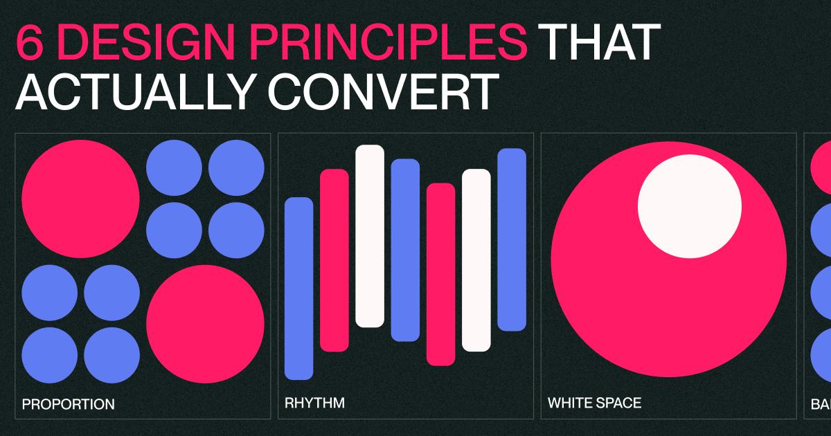
Proportion
Get the scale right, and everything feels deliberate. Proportion guides the eye and it shows what matters most without saying a word. Even small shifts in size or spacing can completely change how something feels.

Hierarchy
Good design directs attention. Hierarchy tells your viewer what to look at first, second, and third.
Use size, colour, and placement to create order.
Tip: Don’t be afraid to exaggerate. Clear beats subtle when it comes to visual storytelling.

Rhythm
A personal favourite: design should move like music. Rhythm comes from repetition: grids, spacing, typography.
When done right, rhythm pulls your viewer through the layout without friction.

White Space
White space isn’t empty, it’s breathing room. It shapes the message and lets your design speak clearly.
Without space, everything shouts. With it, meaning lands.
Tip: Start by taking something away. If it still works, it’s probably stronger.
Design isn’t magic… it’s method.
Once you understand these principles, you start seeing them everywhere.
From websites to brands, it’s what separates the average from the exceptional.
Need that level of intention in your next project? Let’s talk design, development, and everything in between.