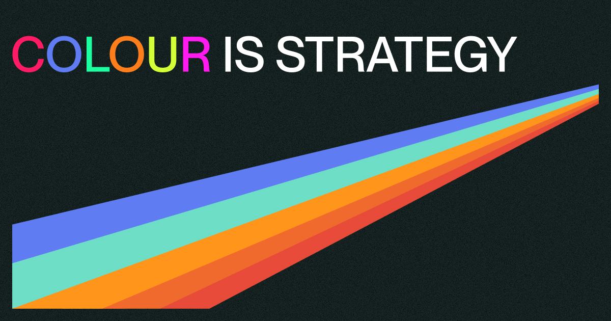
Colour isn’t just about looking good… It’s about making people feel.
The right palette can change how your brand is perceived, guide how users move through your site, and even influence what decisions they make.
In design, colour isn’t decoration. It’s a strategy… here’s why:

Colour creates emotion
Every colour choice sets a tone. Blues are calm and reassuring. Reds energise and demand attention. Yellows spark optimism.
It’s not just aesthetic – it’s psychology. Great design uses this intentionally to guide how people feel, not just what they see.

Colour directs focus
Colour can draw the eye exactly where you want it. A single accent colour against a neutral background can make your call-to-action button impossible to miss. Used well, colour defines hierarchy and builds rhythm across a page.

Colour defines identity
Consistent colour builds recognition. Think of brands like Spotify or IKEA – you could remove their logos, and their palettes alone would give them away. Strategic use of colour ties every element of a brand together into one cohesive story.

Colour sets the atmosphere
On-screen or in print, colour creates an environment. A cool, desaturated palette can make a website feel refined and calm. A rich, saturated mix can make it bold and energetic. Neither is “right” – it’s about matching tone to purpose.

Colour isn’t decoration – it’s direction.
When used with intent, it connects emotion, clarity, and strategy into one seamless visual language.
Need that level of intention in your next project?
Let’s talk design, development, and everything in between.