Your logo is one of the most important design elements of your business. It is the
embodiment of who you are, what you do and what you value. What’s more, you want your
logo to push boundaries, be timelessly cool and yet distinctly unique; you want a punk logo
design. But how do you nail all these elements? Here are five seriously good designs to
show you just how.
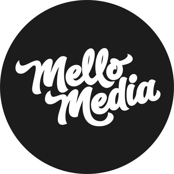
1. Mellow Media

Mellow Media’s logo rocks because it combines simple, smooth contrasts with elegant
custom lettering to create a compelling, edgy wordmark. Custom lettering for logos is worth
the investment because it means you have more creative freedom with your design to
produce a logo that is distinct and personal.
2. Brewdog
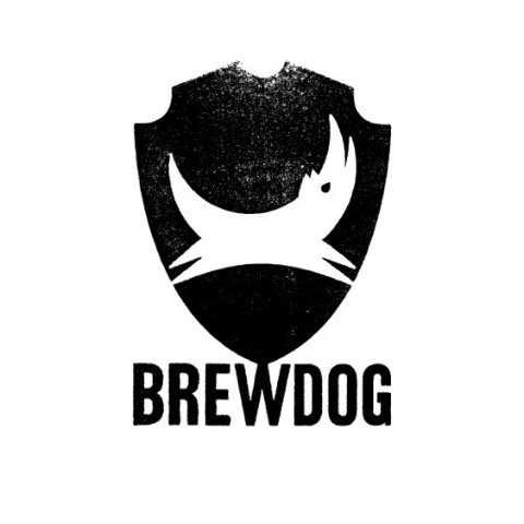
Brewdog combines distressed textures with neat symmetry to pull off a truly punk logo
design. The balance in the lettering and shield contrasts with the rugged textures and
organic curves of the dog. This produces a powerful aesthetic, which embodies the merging
of the old and the new, suggesting on-going heritage, power and community.
3. Nitro USA
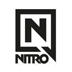
Nitro’s logo is a prime example of excellent geometric design. The layout is clean and
angular with sharp edges and smooth lines, creating a design that is simple and timeless, yet
incredibly bold. By making the letter ‘N’ the focus, Nitro ensure the logo will be an iconic
representation of their business.
4. Induce Media
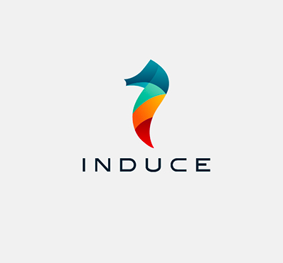
Perhaps you can tell we are suckers for black and white designs, but Induce Media shows
how effective colour can be when it comes to pulling off a punk logo design. It’s often tricky
to nail colour – some designers will misuse or over-complicate it. Induce have instead used organic icons and strong colour gradients to create a design that is modern and vibrant without being overpowering.
5. Aphex Twin

This killer logo belongs to electro musician Aphex Twin, and guess what? It’s over 25 years
old. The logo was originally hand drawn using circle templates and rulers in 1991 and has
remained unchanged since. An old school punk logo design, it has stood the test of time
because of its artistic, out-of-the-box thinking. The logo merges both the geometric and the
organic to create a completely unique shape. It’s the perfect example of how to push
boundaries and make your own trend.