How we designed our new identity
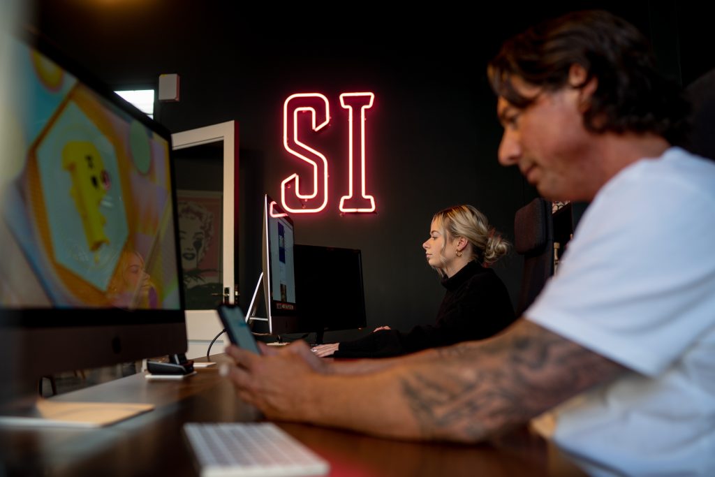
In Evolution of a brand, part one: how we reinvented our identity, we revealed how Illicit Web Design discovered the need to refresh our brand as a result of our company growth and it ‘coming into its own’. Having laid the foundations by developing our mission statement and discovering our brand personality, we were ready to get to work on the name and designs.
Studio Illicit is born
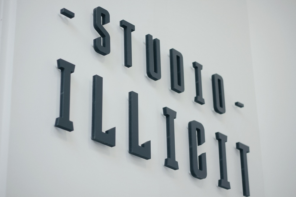
Armed with a clear sense of self, we began to tackle our company name. Illicit, we concluded, remained the perfect moniker for our company of digital renegades. But the ‘Web Design’ part was a problem. Although designing and building websites is still our number one craft, we are also in the business of graphic, print, logo design and digital marketing. So widening our offer and emphasising our creative and collaborative modus operandi, we arrived at Studio Illicit. It felt freer, open, and just a little classier.
The logo design
The fun part was developing a logo that would complement both the name and vividly express everything behind the brand. We began by once again researching other brands, designers and artists – ones that had successfully produced a perfect symbol for their ethos, aims and characteristics. Some of our favourites were quickly identified, from craft beer superstars Brewdog to techno artist Aphex Twin. They are discussed in detail elsewhere on our blog.
Although we didn’t draw direct stylistic inspiration from their designs, they gave us insights into the ways in which we should approach our designs, namely to use typography and form to create a visual representation that was true to us.
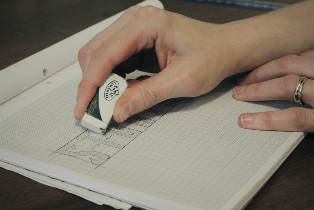
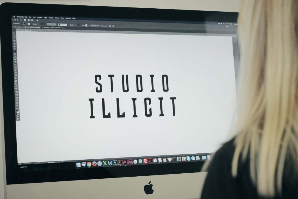
Over Christmas, we gathered fonts, symbols, illustrations and started to sketch. In the end we settled on a custom wordmark, ditching the colours and emblematic form of our former logo design and drawing our own lettering from scratch. We absorbed further visual influences from the world of American sport, guitar manufacturers, bars and even Mexican diners to create a highly condensed set of letters which would evoke both a hip, arty band-style logo and digital-watch display with their wide tracking (letter spacing), stark black and white colour palette, and combination of curves and sharp angles.
Finally we can say that we have found ‘us’ and we know how exactly how to convey ourselves. We have consolidated a brand that is completely true to our collective personality, our approach to our work and our relationships with our clients. Studio Illicit is our present and our future.