


Inside the Redesign of Our New Website
There’s an old saying that you’re your own toughest critic. As it turns out, you’re also your most demanding client.
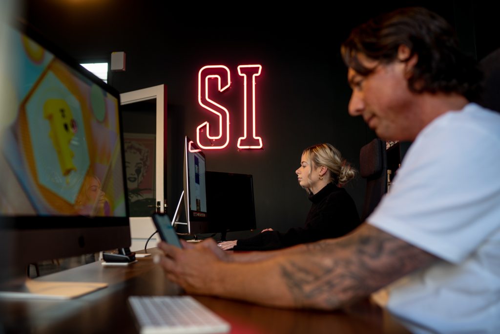
When we decided it was time to redesign the Studio Illicit website, we resisted the temptation to simply make it look better (that would have been the easy part!). Instead, we treated the project exactly as we would for any client who came through our door, because over the years we’ve learnt that a successful website is never really about the website itself.
We recently wrote about how businesses no longer want “just a website”. They want something that supports growth, earns trust, generates opportunities and continues delivering value far beyond launch day. It would have been difficult to make that argument if our own website didn’t reflect the same philosophy.
So we put ourselves through our own process.
Becoming Our Own Client
The project began with workshops rather than wireframes.
Before anyone opened a design file, we spent time challenging assumptions about who we are today and where the business is heading. We mapped user journeys, reworked the site architecture and produced an entirely new brand identity document to define how Studio Illicit should present itself going forward. Like many businesses, we’ve evolved considerably over the last few years, and our website had gradually fallen behind that evolution.
Designing with Purpose
Design followed, but not in a straight line.
Every page was mocked up, reviewed, questioned and refined through countless iterations until each decision felt justified rather than simply preferred. The copy received the same treatment. Entire sections were rewritten because they described the business we used to be rather than the agency we’ve become.
Building for Search and Performance
From there, we approached the site exactly as we would for our clients. Search visibility was considered from the outset through SEO, GEO and Answer Engine Optimisation, ensuring content was structured not only for traditional search engines but for the growing number of AI-powered discovery platforms. We carried out a full SEO audit, monitored progress through weekly project updates and tested relentlessly, not only for functionality but for performance.
Testing Every Detail
Every call to action was scrutinised. Wording, placement, spacing and hierarchy were adjusted repeatedly to improve conversion. The site was tested across devices, benchmarked using Google Lighthouse and refined until the experience felt consistent regardless of how or where someone discovered us.
None of those steps are particularly glamorous, but they’re the difference between launching a website and building one that’s capable of performing.
Fixing the Gaps We Could Finally See
One of the unexpected benefits of becoming your own client is that it forces uncomfortable conversations.
We realised our messaging no longer reflected the work we actually do.
For years, Studio Illicit had become known for designing and developing beautiful websites, but our role within our client relationships had quietly grown into something much broader. We spend as much time helping businesses think about visibility, growth, lead generation, long-term optimisation and digital strategy as we do designing pages.
The old website didn’t really communicate that. It still suggested we built websites, when in reality we help businesses build stronger digital foundations.
Strengthening Trust
Trust was another area that deserved greater prominence. We’ve spent more than fifteen years working alongside over 250 businesses, many of whom have partnered with us for years across multiple website generations. We have long-standing relationships we’re incredibly proud of, scores of five-star Google reviews that reflect how we work and measurable results delivered for clients across a wide range of industries. Yet much of that evidence was either hidden or understated.
This redesign gave us permission to finally tell those stories properly.
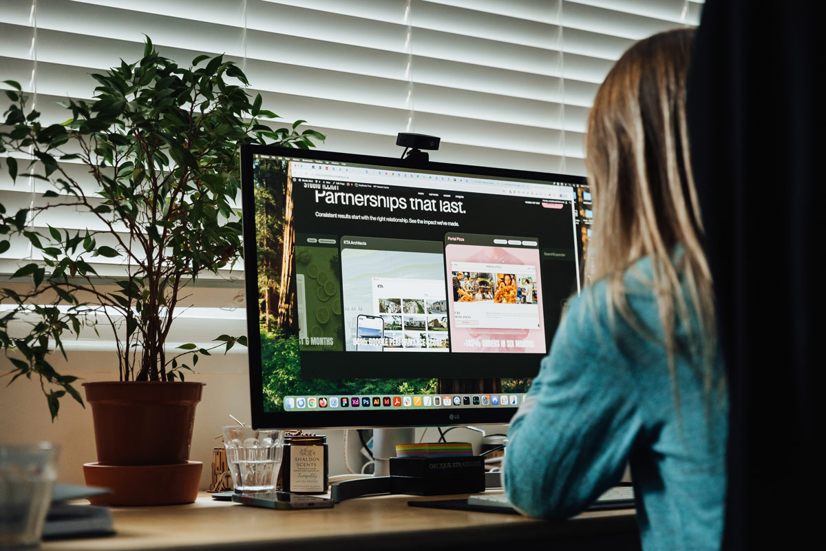
Case studies now appear throughout the website rather than being tucked away in a single section. They provide evidence exactly where visitors need reassurance, demonstrating not only what we’ve created but the outcomes those partnerships have produced over time.
Creating a Better User Experience
The journey through the website also became far more intentional. Every section has a clear purpose within the wider narrative, guiding visitors naturally towards relevant next steps without forcing unnecessary decisions. Information has been organised into clearer content structures using thoughtfully designed cards that separate complex subjects into manageable pieces, making the experience easier to navigate while maintaining consistency across every page.
Accessibility influenced almost every visual decision. Colour palettes were refined to improve contrast, strengthen informational signposting and ensure the website feels as usable as it is visually engaging. Photography and video were completely refreshed to better represent the people behind Studio Illicit alongside the businesses we work with, creating a far more authentic picture of who we are today.
Practising What We Preach
Perhaps the biggest lesson from redesigning our own website is that it’s remarkably easy for any business to outgrow its digital presence without noticing.
Growth happens gradually. Services evolve. Relationships deepen. Expertise develops. Before long, the website that once felt perfectly accurate becomes a snapshot of a business that no longer exists.
That’s exactly why we believe websites should never be viewed as immovable marketing assets. They’re living, breathing parts of a business that need to evolve alongside the organisations they represent.
Designed for the Journey Ahead
Working on our own website reminded us why our process has developed the way it has over the years: good outcomes rarely happen because of a single creative idea. They come from asking better questions, testing assumptions, measuring performance and making hundreds of considered decisions that collectively improve the experience for the people using the site.
Launching the new Studio Illicit website isn’t the finish line any more than it is for our clients. It’s simply the beginning of the next stage. We’ll continue monitoring how people use it, refining journeys, improving content and making evidence-based decisions as the business continues to move forward.
After all, if we genuinely believe nobody wants just a website anymore, then our own website should be proving that every single day.