



Most websites choose their two most-used colours by accident. Someone drags the picker into the corner, lands on #000000, and that value ends up under every heading, border and background for the life of the site. Nobody decides on it. It arrives, and then it stays.
That matters more than it sounds like it should, because those two colours cover most of the screen. They are the first thing a visitor’s eye adjusts to and the last thing anyone consciously notices. Get them right and a site feels considered. Leave them on the defaults and it feels generic, even when the work sitting on top of them is good.
What pure black and white actually do
Screens are lit from behind. Pure black beside pure white asks a backlit panel to output nothing at all directly next to something outputting everything, and people read that as harsh long before they can explain why. On a phone at night it is genuinely uncomfortable.
There is a structural cost too. If the darkest colour in a palette is already #000000, there is nowhere left to go: no shadow can sit beneath a dark card, no hover state can go deeper. Pure white causes the same problem in reverse, flattening photography by mounting it on a wall of maximum brightness.
Four pairs that do the job better
The fix is small. Take the darkest colour and give it a hue. Do the same with the lightest. A shift of three to eight percent saturation is enough to change how a page feels without anyone being able to point at what changed.
Soot and Bone
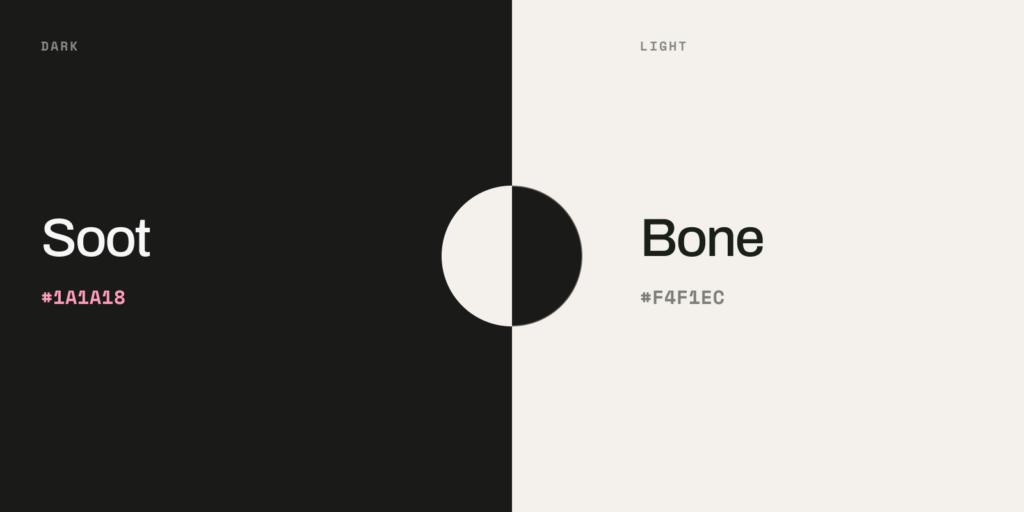
Both carry a trace of brown, which is why the pairing reads as printed rather than lit. The safest place to start, because it behaves like black and white without the harshness.
Ink and Mist
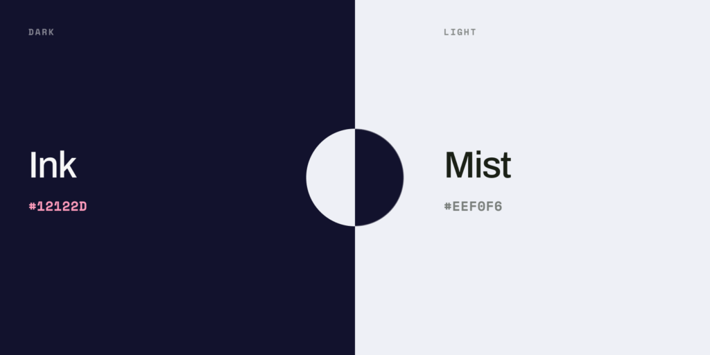
Blue-leaning, and the most useful pair on screen. The navy undertone adds depth without announcing itself, and makes whites beside it look cleaner than they are. Suits work that needs to feel precise.
Espresso and Oat
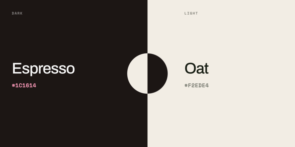
The pairing to use when a site is carried by photography. Nothing in the palette competes with the images, and skin tones hold their warmth.
Moss and Paper
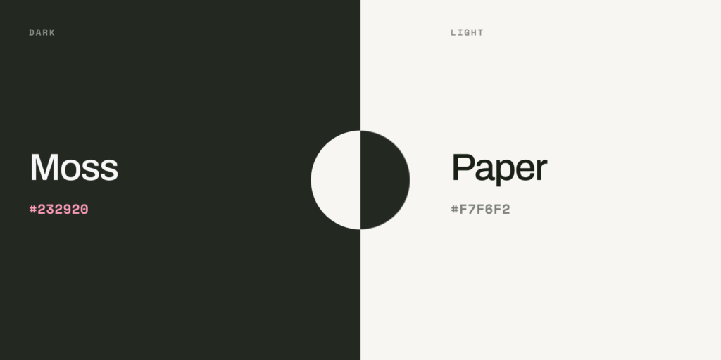
Our own. An olive-black and a warm paper white, with a single accent doing the work. The olive is warm enough to sit beside greens and creams without arguing, which keeps the site from feeling like a developer tool.
The decision is the point
No visitor will ever comment on an off-black. But people form an impression of a business within seconds, and that impression is assembled from dozens of things they never consciously register: the weight of a heading, the space around a button, the warmth of a background. Individually, none of it matters. Together, it is the difference between a site that feels built and one that feels assembled from parts.
So the question worth asking of any project is not which hex code is correct. It is whether a choice was made at all. That is the level of attention we bring to every project, and neutrals are one decision out of hundreds.