


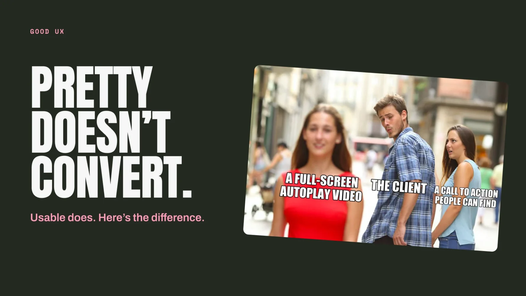

Every few weeks someone sends us a website and says “we love the look of this one”. And every few weeks I open it, try to find the phone number, give up, and quietly add it to the folder of beautiful websites that have never generated a lead.
That is the whole problem with UX in one sentence. It is invisible when it works and expensive when it does not. Nobody has ever rung us to say “your navigation was so intuitive I bought a hot tub”. They just buy the hot tub. When the navigation is bad, they do not ring either. They leave, and the business owner concludes that “the website doesn’t really do much for us”.
So this post is our attempt to explain what UX actually is, why it is the thing standing between your website and the enquiries you want, and what good looks like. It is written for people who run businesses, not for designers. There are memes. You have been warned.
What is UX, in plain English?
UX stands for user experience. Strip the jargon out and it means: how easy and pleasant is it for a real person, on a real device, with a real amount of patience, to do the thing they came to your website to do.
That is it. Not how it looks. Not how clever the animations are. Whether someone can land on your site, understand what you do in a few seconds, find what they need, and take the next step without swearing at their phone.
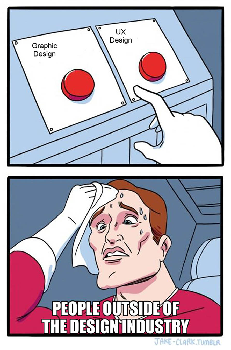
Graphic design is what the site looks like. UX is what it is like to use. They overlap, they need each other, and confusing the two is the single most common mistake we see when a business briefs a new website.
Why UX and conversion are the same conversation
A conversion is any action you want a visitor to take. A form submission, a phone call, a quote request, a checkout, a booking. Conversion rate optimisation, which we wrote about in CRO in 2026: what’s changed since “just A/B test it”, is the discipline of getting more of those actions from the same traffic.
Here is the thing nobody tells you: almost every conversion problem is a UX problem wearing a disguise.
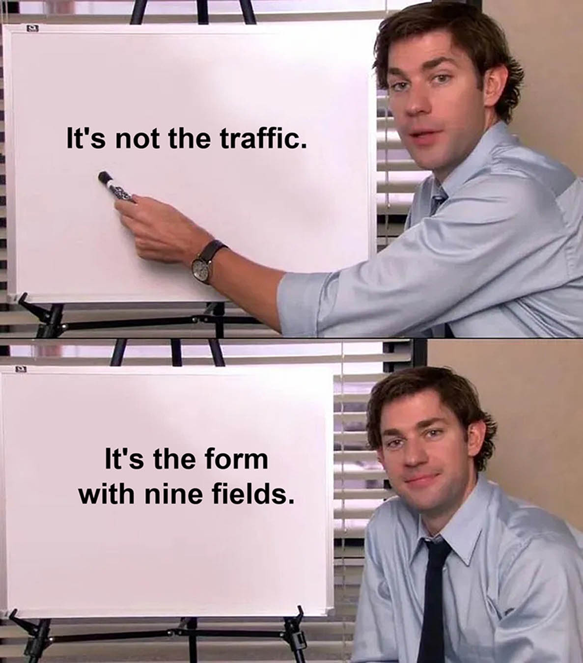
Nobody is filling in the form. The form has nine fields and asks for a fax number.
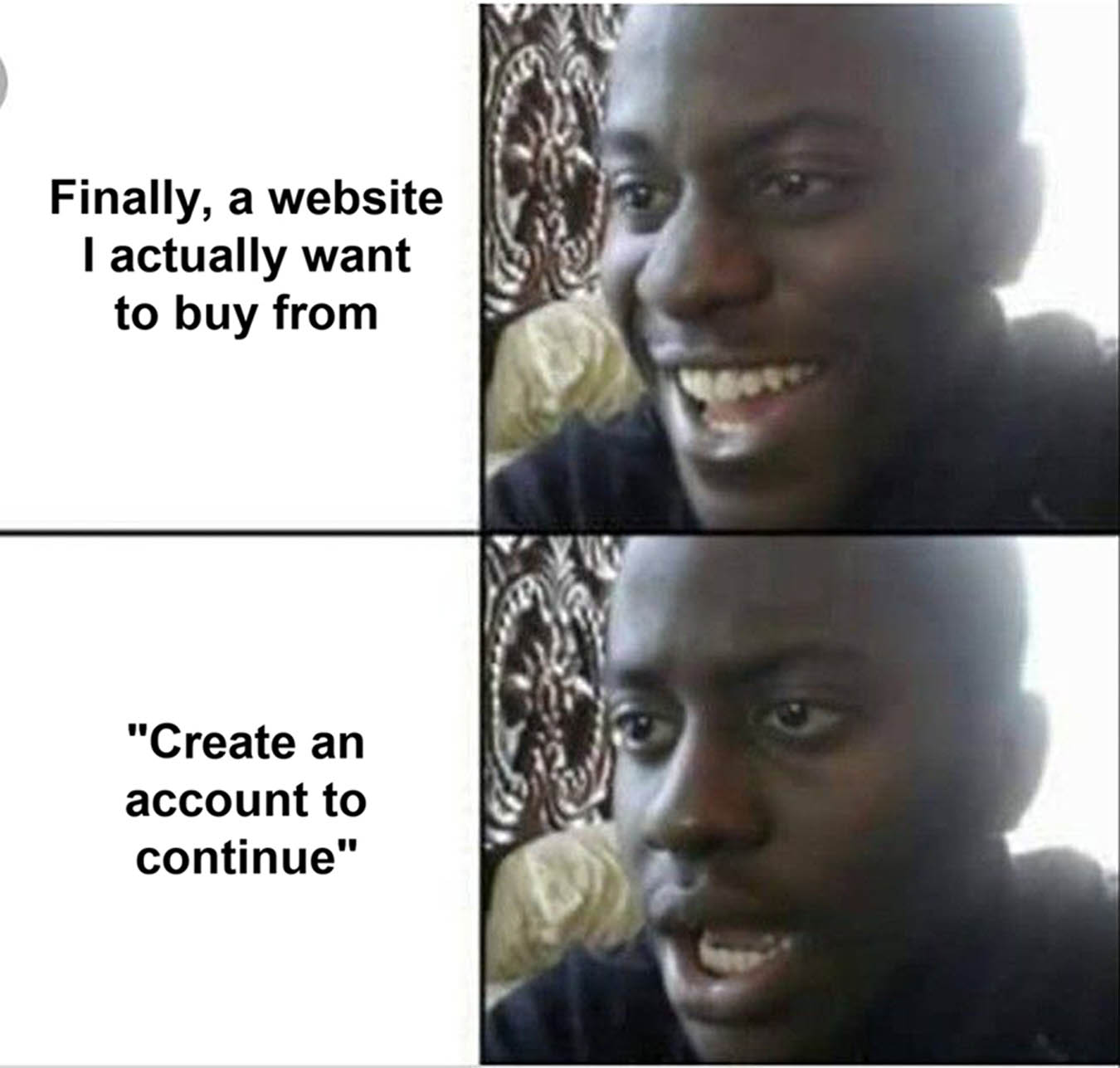
People add to basket and never buy. The checkout forces them to create an account first. Baymard Institute’s checkout research has found that around a quarter of people who abandon a purchase do so specifically because the site wanted them to make an account.
Mobile traffic bounces. The site takes six seconds to load on 4G and the “Get a quote” button is hiding under a cookie banner, a chat widget and a newsletter pop-up. Google’s own research found that most mobile visits are abandoned if a page takes more than three seconds to appear.
Traffic is decent but nobody calls. The phone number is in the footer, in grey, at 12px.
None of those are marketing problems. None of them are fixed by “more traffic”. They are fixed by taking the friction out of the experience, and that is what UX work is.
The eight-second problem
You have roughly eight seconds from someone landing on your homepage to them deciding whether you are worth their time. In those eight seconds they are asking three questions:
What is this?
What does this business actually do? If your hero section says “Empowering tomorrow’s solutions today”, the answer is “no idea”, and they are gone.
Is it for me?
Do you work with businesses like mine, in my area, at my sort of budget? Show your work. We keep our portfolio one click from every page for exactly this reason.
What do I do next?
Where is the button? What happens when I press it? If there are four buttons of equal weight all shouting different things, you have given them a decision instead of a path.
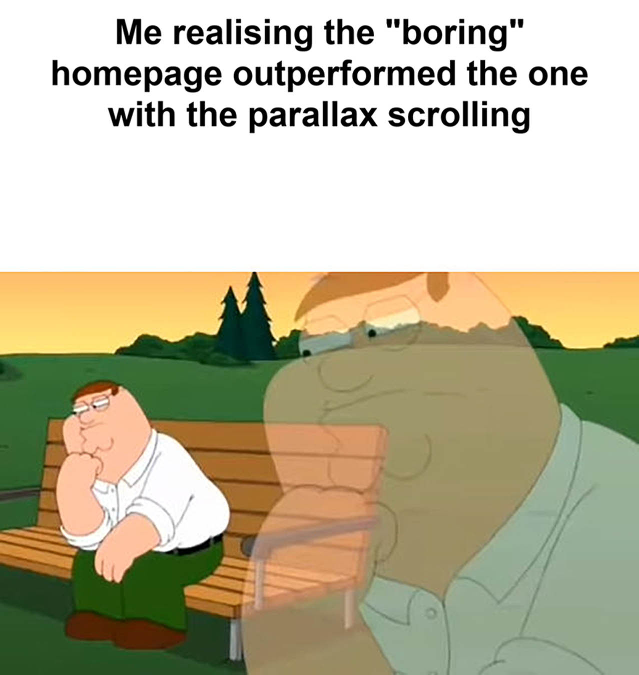
Good UX answers all three before the visitor has scrolled. It is not glamorous. It is a clear headline, a sentence of proof, and one obvious next step. That is the whole homepage recipe, and it outperforms the clever version almost every time.
The UX decisions that actually move the needle
There are hundreds of things you could tweak. These are the ones we see paying for themselves over and over.
One clear call to action per screen
Not one per page. One per screen. Wherever someone stops scrolling, there should be an obvious, sensibly worded thing to press. “Get a quote” beats “Submit”. “Book a free survey” beats “Learn more”. Say what will happen when they click.
Navigation a stranger could use
Your menu is not the place to be creative. “Services”, “Work”, “About”, “Contact”. If you have to explain what a menu item means, rename it. If you have fourteen items, you do not have a menu, you have a sitemap.
Forms that respect people’s time
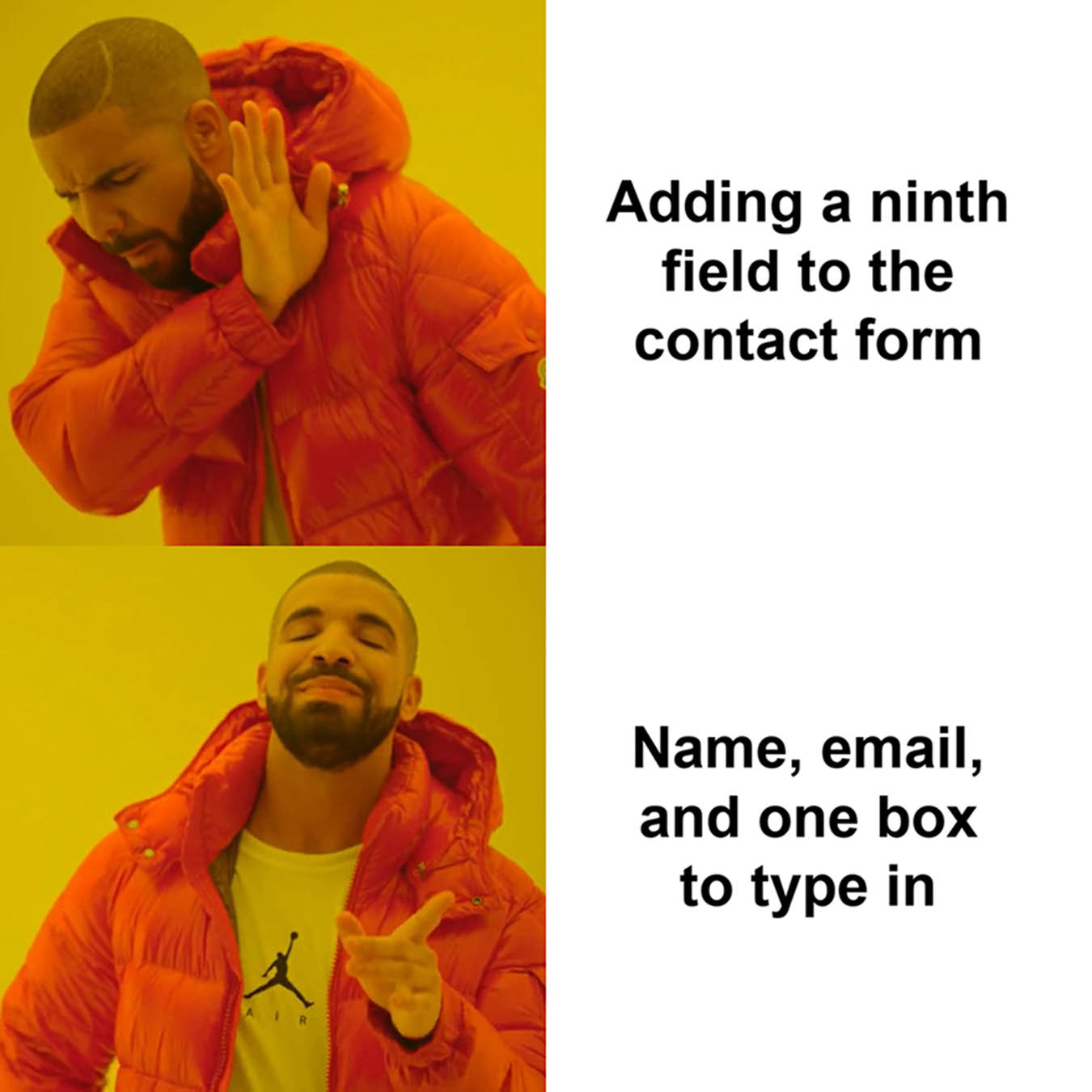
Every field you add is a reason to give up. Ask for the minimum you need to have a useful conversation: name, email or phone, and a box to type in. You can ask for the rest on the call. Mark the required fields, show errors next to the field that caused them, and never, ever clear the form when something goes wrong.
Speed, on a phone, on a bad signal
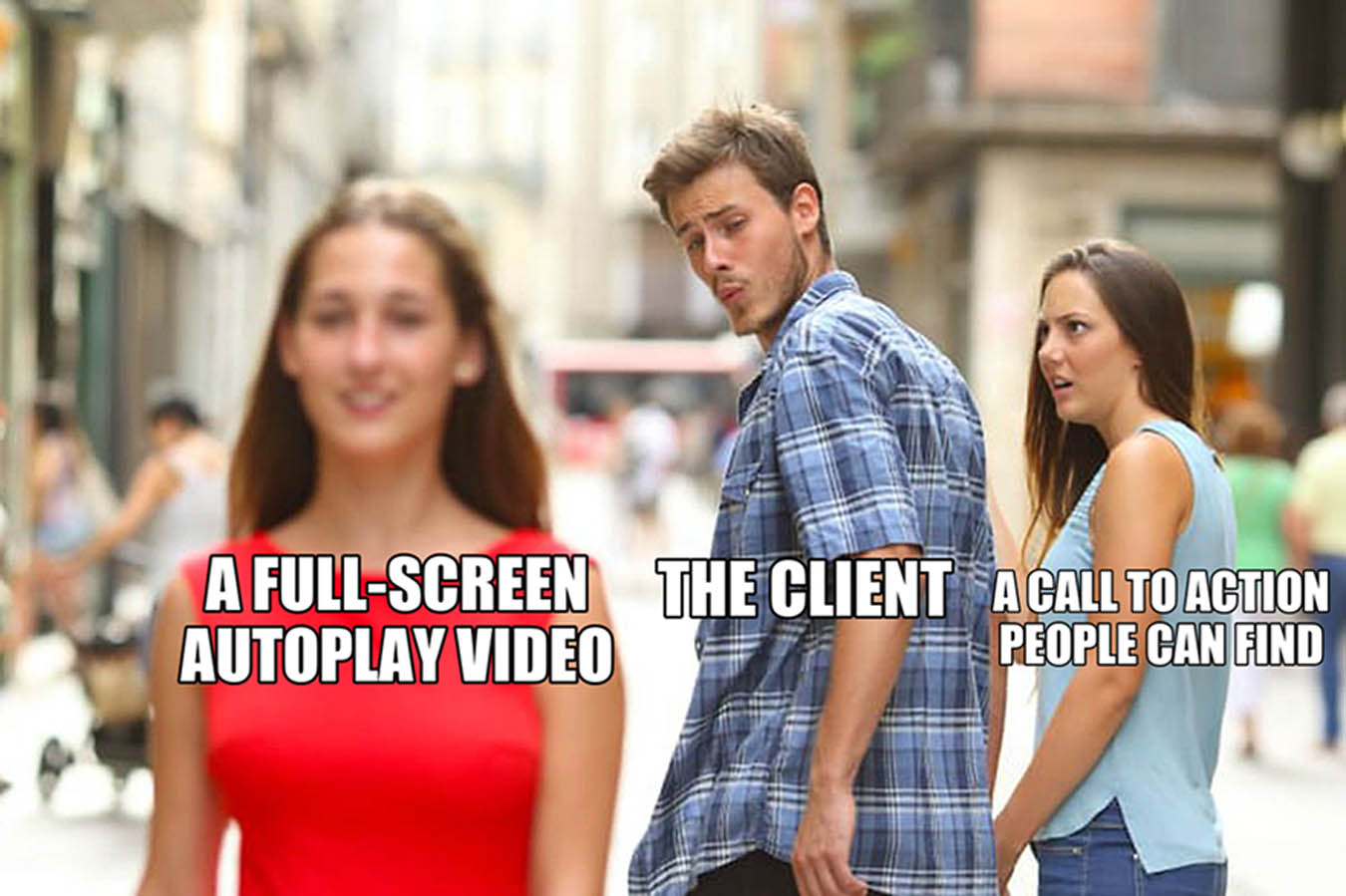
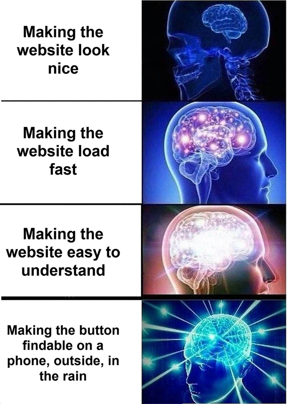
Test your site on your own phone, outside, on mobile data. Not on the office Wi-Fi. If it feels slow to you, it is losing you customers. Oversized images, autoplaying video and third-party scripts are the usual suspects, and they are all fixable.
Guest checkout, obviously
If you sell online, let people buy without creating an account. Offer the account after the order, when they have already paid and have a reason to want one. We went into this in more depth in Subscription UX that doesn’t feel like a trap.

Readable type and honest contrast
If your body copy is light grey on white because it “looks cleaner”, it is unreadable for a big chunk of your visitors and mildly annoying for the rest. Contrast is not a style choice, it is an accessibility requirement and a conversion lever. We wrote about picking neutrals properly in Forget pure black and white.
Proof near the ask
Put a testimonial, a logo strip, a review score or a case study next to the point where you ask for the enquiry. People hesitate right before committing. Give them a reason not to.
Do not interrupt people who are trying to give you money
Exit-intent pop-ups, spin-to-win wheels, chat widgets that bounce, cookie banners that cover the entire viewport. Every one of these is a tiny tax on the person’s patience. Some are legally necessary, and we covered the sensible way to handle tracking in The end of cookie comfort. The rest should justify their existence with data or be removed.
“But it looks great”
It might. Looking great matters. First impressions are visual and a dated, cluttered site tells people you are a dated, cluttered business before they have read a word. That is why our website design work starts with brand and visual direction.
But looking great is the entry fee, not the prize. The websites that quietly generate enquiries every week are the ones where the design is in service of the user rather than in competition with them. Bold typography, plenty of space, a strong photo, and then absolutely nothing getting between the visitor and the button.
If you want a live example of design and UX pulling in the same direction, have a read of what happened when we became our own client. It was humbling.
How to tell if your website has a UX problem
You do not need a consultant for this. You need ten minutes and a bit of honesty.
Do the stranger test
Show your homepage to someone who has never heard of you for five seconds, then take it away. Ask them what you do and who it is for. If they cannot answer, neither can Google’s visitors.
Try to enquire, on your phone, from the homepage
Count the taps. Note every moment you have to think. Anything above about three taps or one “hmm” is worth fixing.
Look at your data
If you have analytics set up properly, the drop-off points are already visible: which pages people leave from, where forms get abandoned, what mobile is doing compared to desktop. If you do not have it set up properly, start with the data your website should be capturing but probably isn’t.
Read your own contact form
Fill it in yourself. If you have not received the email by the time you have made a cup of tea, it is broken, and it has probably been broken for a while.
UX, search, and the AI middlemen
One more reason this matters now more than it did five years ago. Search engines and AI assistants increasingly judge your site the way a user would: is it fast, is it clear, does it answer the question, is it structured properly. A site that is easy for a person to use tends to be easy for a machine to understand, which is why UX and search have become the same project. We went into where that is heading in How GEO is shaping search intent and web design and Beyond branding: why AI is reshaping online strategy.
Short version: the clearer your site is for a human, the more of it a machine can confidently repeat.
So, there you have it
UX is not the fluffy bit of web design. It is the bit that decides whether the site does anything for you. A clear message, an obvious next step, forms that respect people, speed on a phone, and nothing getting in the way. Do those well and the “pretty website” and the “website that generates leads” turn out to be the same website.
If you suspect yours is on the wrong side of that line, we will happily take a look. We will be honest about what is worth fixing and what is not, and we will try to keep the memes to a minimum. No promises.
FAQs
What is the difference between UX and UI?
UI (user interface) is what you see: the buttons, colours, type and layout. UX (user experience) is how it all works together for the person using it. Good UI is part of good UX, but you can have a gorgeous interface that is miserable to use.
Does good UX really increase conversion rate?
Yes. Most conversion problems are friction problems: unclear messaging, hard-to-find calls to action, long forms, slow mobile pages and forced account creation. Removing that friction is UX work, and it is usually the cheapest way to get more from the traffic you already have.
How much does it cost to improve the UX of an existing website?
It depends on what is wrong. Some of the highest-impact fixes, like rewording a headline, cutting form fields or moving the phone number, cost very little. Structural problems like a confusing navigation or a slow theme cost more. A short audit will tell you which camp you are in.
How do I know if my website has a UX problem?
Look for high traffic with low enquiries, a big gap between mobile and desktop performance, form abandonment, or people telling you they “couldn’t find” something you know is on the site. Then do the stranger test above.
Is UX only for ecommerce websites?
No. Any site that wants someone to do something, whether that is call, book, enquire, download or buy, depends on the experience being easy. Ecommerce just makes the cost of bad UX easier to measure.
Ready to Fix your UX?
Wondering whether your setup has crossed from “could be better” into “needs attention”? That’s exactly the sort of thing we can help with.