


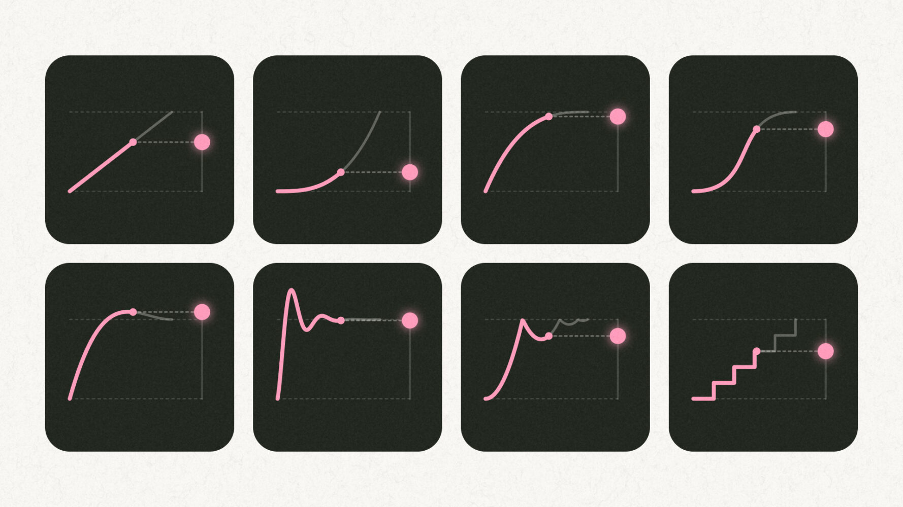

You know the one. A logo slides in at a single steady speed, stops dead, and the whole site suddenly feels a bit cheap. Nothing’s wrong with the design. The problem is the easing, and once you’ve spotted it you’ll see it everywhere.
Easing is how the speed of something changes while it moves. Real things never go from standing still to full speed in one frame. A car pulls away gently, a door slows down before it clicks shut, and a dropped phone speeds up all the way to the floor (sorry). Motion on a website feels right when it borrows from that.
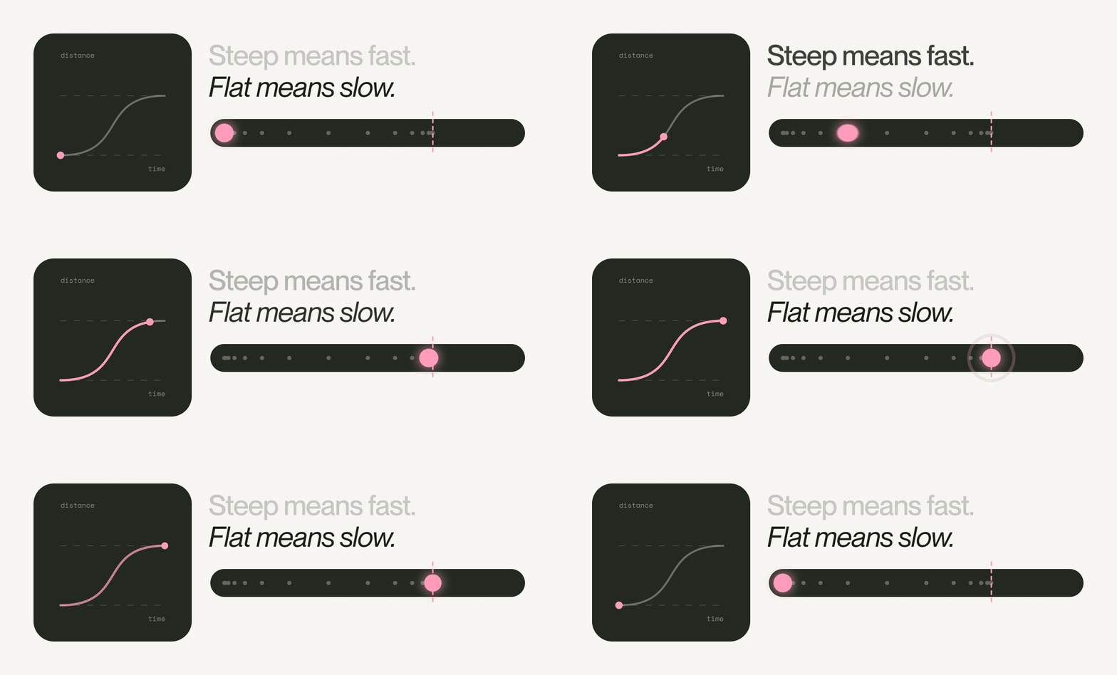
Steep means fast
Every ease can be drawn as a curve, with time along the bottom and distance up the side. Where the line is steep, things are moving fast, and where it flattens out they’re barely moving. That’s all you need to read the easing menu in any tool.
The faint dots in our GIFs mark where the ball is every tenth of a second. Bunched up means slow, spread out means fast.
Eight eases, one race
Every ball below covers the same distance in the same 1.4 seconds. Only the easing changes, and look how differently they move.
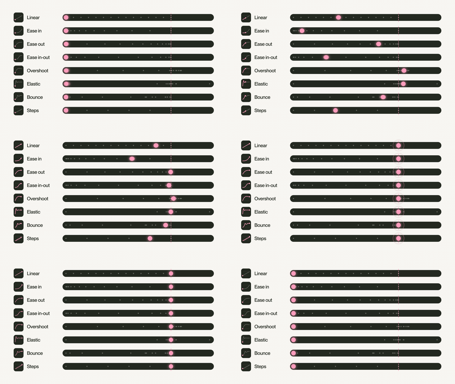
Linear
One speed from start to finish, like a conveyor belt. It’s perfect for spinners, progress bars and anything that loops. Put it on something arriving, though, and it stops like it’s walked into a glass door.
CSS linear · GSAP "none"
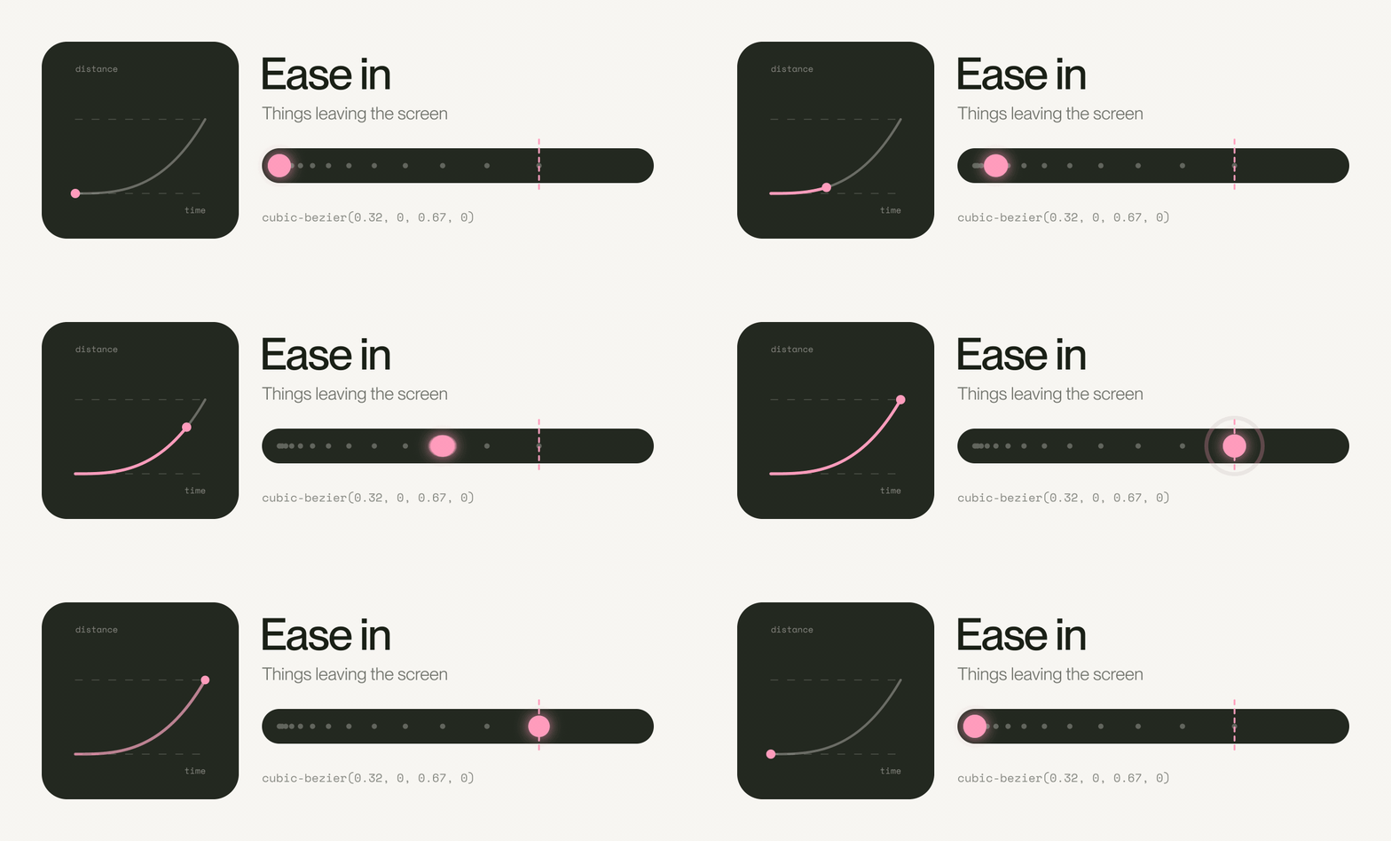
Ease in
Starts slow and leaves fast, which makes it great for exits: a notification flicking away, a menu closing. Use it for arrivals and things slam into place like they’ve lost their brakes.
CSS cubic-bezier(0.32, 0, 0.67, 0) · GSAP power2.in
Ease out
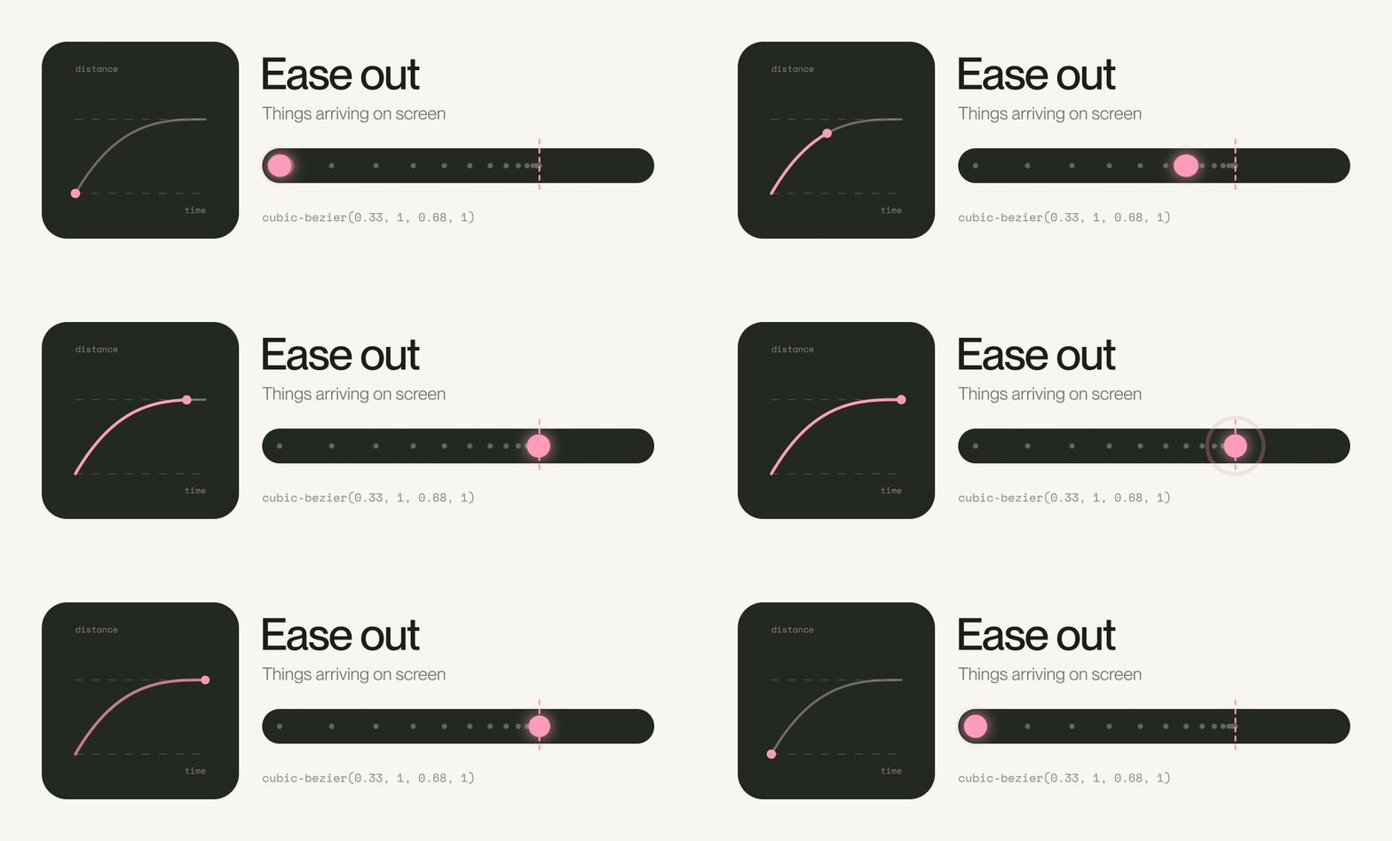
Arrives fast and settles gently. If you remember one ease from this post, make it this one, because it’s right for nearly everything that appears on a website. It moves the moment you tap, so it feels quick, and it lands softly, so it feels finished.
CSS cubic-bezier(0.33, 1, 0.68, 1) · GSAP power2.out
Ease in-out
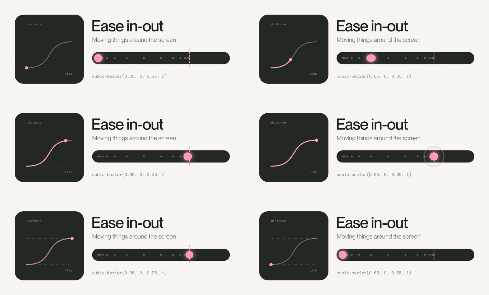
Slow, fast, slow, like a lift between floors. Use it for things that move from one spot to another without leaving the screen, like a carousel or a sliding tab underline. Keep it short, or the page feels like it’s thinking about it.
CSS cubic-bezier(0.65, 0, 0.35, 1) · GSAP power2.inOut
Overshoot
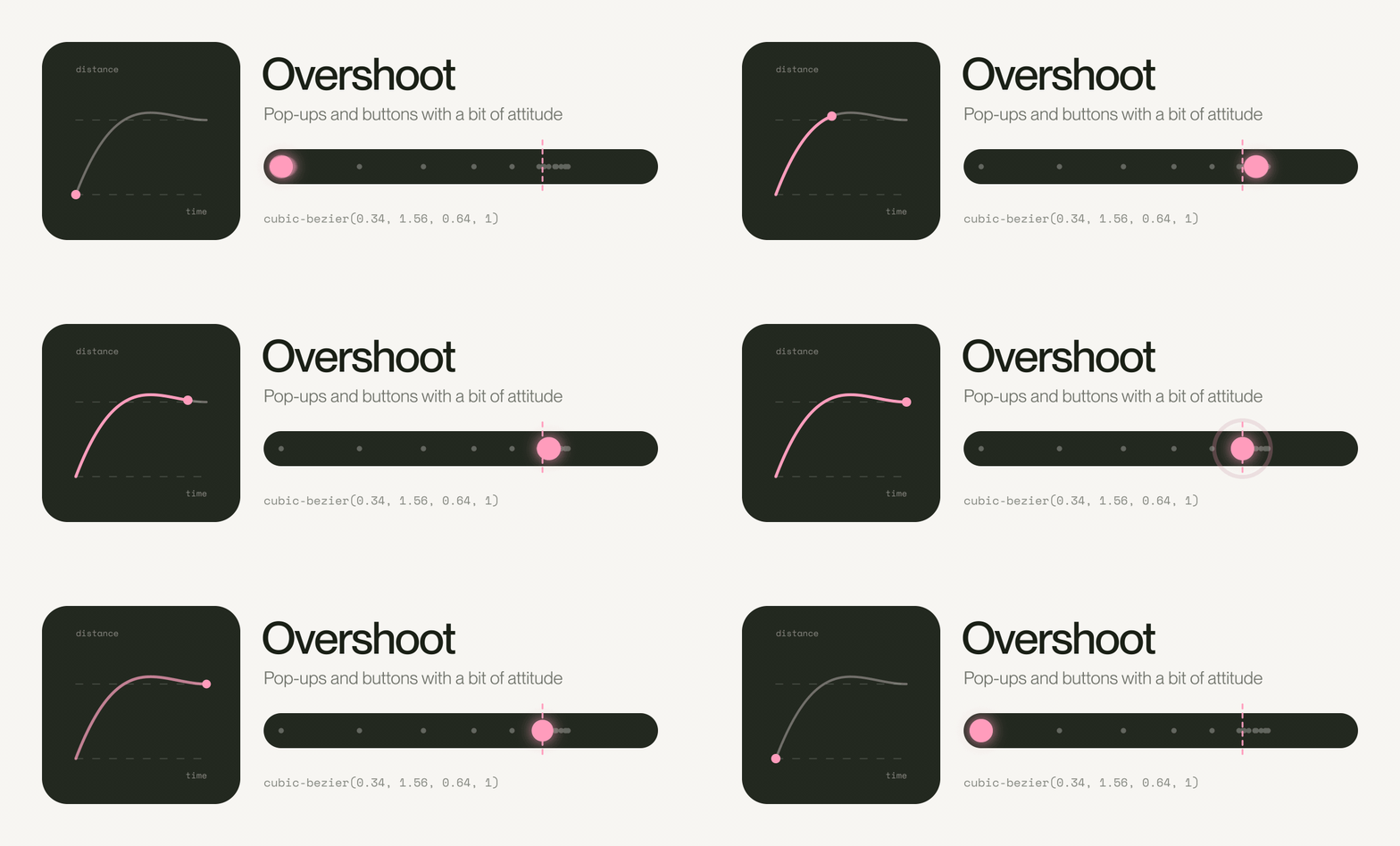
Goes a touch too far, then settles back. This is where interfaces get their personality: buttons, badges, the little heart when you like something. Keep it to small things, because a whole page overshooting just looks broken.
CSS cubic-bezier(0.34, 1.56, 0.64, 1) · GSAP back.out(1.7)
Elastic
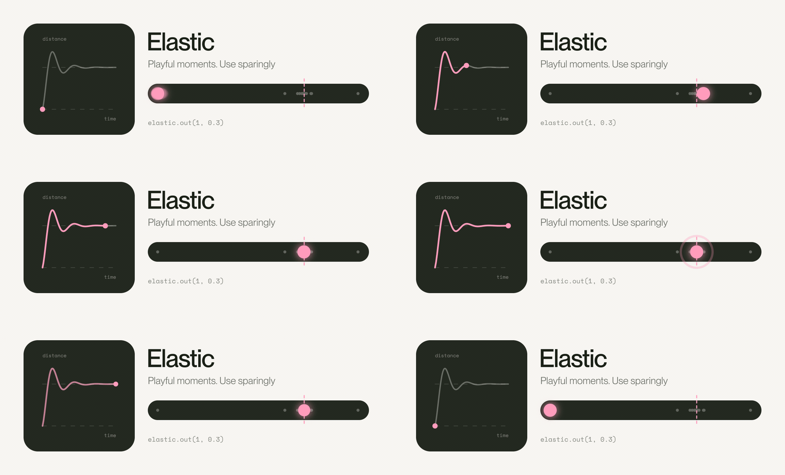
Boing. Brilliant the first time and irritating by the fiftieth, so save it for a success message or a brand that’s properly playful.
CSS linear(), see below · GSAP elastic.out(1, 0.3)
Bounce
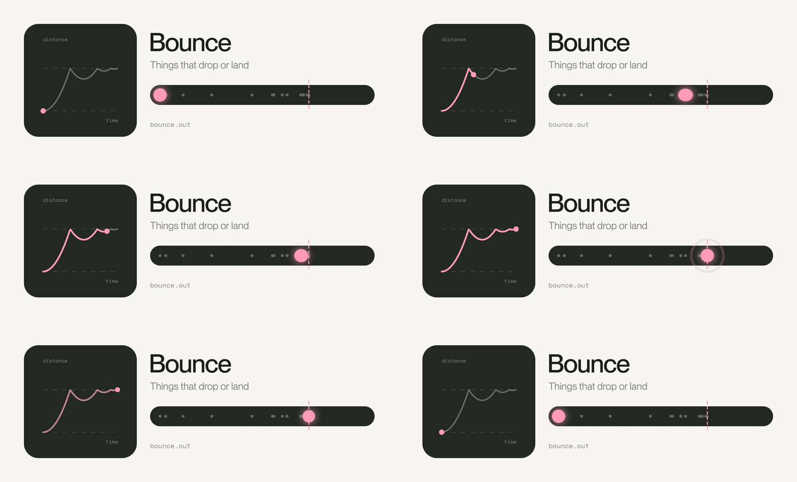
Hits the end and bounces like a dropped ball. It suggests weight and gravity, so it suits things that drop or land.
CSS linear(), see below · GSAP bounce.out
Steps
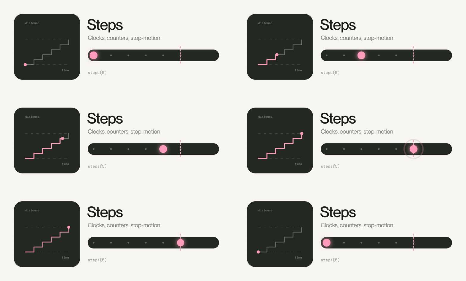
No easing at all, on purpose. It jumps between positions like a clock’s second hand, which is exactly what you want for counters, typewriter text and anything meant to feel like stop-motion.
CSS steps(5) · GSAP steps(5)
The short version
- Arriving: ease out
- Leaving: ease in
- Moving around the screen: ease in-out
- Looping or spinning: linear
- A bit of attitude: overshoot, sparingly
As for speed, our rule of thumb is 150 to 250 milliseconds for small things like buttons and toggles, and 250 to 400 for menus and panels. Go past half a second and people start waiting for your animation instead of enjoying it.
Animating video in After Effects instead? Same curves, back-to-front names: Easy Ease In is what CSS calls ease out.
Why we started using GSAP
CSS is fine for the simple stuff, like a hover or a fade. GSAP, the GreenSock Animation Platform, comes in when motion has to run in a sequence, follow the scroll, or change its mind halfway without jumping.
When Webflow bought GreenSock in late 2024, we half expected GSAP to disappear inside Webflow. Instead, in April 2025, the whole library went free for everyone, including plugins like SplitText that used to cost money, and since the summer it’s been in most of the sites we build.
Our rules for it fit in four lines:
- One ease per site: a signature curve, so every movement feels like it came from the same hand.
- Arrivals ease out: things coming onto the screen land in under a second.
- Less motion on request: if someone’s turned on reduce motion, it switches off.
- Nothing hidden: GSAP sets the starting positions when it runs, so if the script fails the page still works.
gsap.registerPlugin(ScrollTrigger);

const mm = gsap.matchMedia();

mm.add("(prefers-reduced-motion: no-preference)", () => {
  gsap.utils.toArray("[data-reveal]").forEach((el) => {
    gsap.from(el, {
      y: 32,
      opacity: 0,
      duration: 0.9,
      ease: "power3.out",
      scrollTrigger: { trigger: el, start: "top 85%" },
    });
  });
});
Three of ours, in the wild
Stonefort Marine
On Stonefort Marine, the headline rises line by line from behind a mask while the video behind it eases out of a slight zoom, and further down the numbers count up. Almost everything runs on one ease, cubic-bezier(0.19, 1, 0.22, 1). It does most of its moving straight away and then takes its time landing, which suits a business that wants to feel calm and in control.
Topsham Brewery
Topsham Brewery’s name rises in letter by letter, and each big heading sweeps up a character at a time as you scroll. Further down, the mission statement lights up as you read it. That one is tied straight to the scrollbar, so its ease is set to "none". Your thumb already does the speeding up and slowing down, and the words just follow.
Jolly Pottery
The Jolly Pottery is built in Bricks, with its animation set up in Bricksforge, which runs on GSAP underneath. The headline pops in letter by letter, “Paint a Pot” rises as you scroll, and the reviews panel curves its corners into an arch on the way up. The row of pots in between drifts at one steady speed. It never starts or stops, so it’s one of the few places linear is exactly right.
Be kind to people who’d rather not
Some people feel dizzy or sick when things move on screen. Every phone and computer has a reduce motion setting, and a website can respect it with a few lines of CSS:
@media (prefers-reduced-motion: reduce) {
  *, *::before, *::after {
    animation-duration: 0.01ms !important;
    animation-iteration-count: 1 !important;
    transition-duration: 0.01ms !important;
    scroll-behavior: auto !important;
  }
}
It’s one small part of designing for everyone, which we wrote about in our look at web design in 2026.
So, there you have it
Next time something you’ve built feels a bit off, check the easing before you change anything else. In my experience it’s the culprit far more often than the design. Motion is a small part of good UX, but people feel it without ever noticing it.
If your site feels a bit static, or worse, a bit twitchy, have a look at how we design websites or get in touch. And if you want all eight on your phone, save the cheatsheet.
FAQs
What is easing in animation?
Easing controls how an animated object’s speed changes as it moves. Instead of one constant speed, it can start slowly, finish slowly, or both, which makes the motion feel natural.
What’s the difference between ease in and ease out?
Ease in starts slowly and speeds up, so it suits things leaving the screen. Ease out starts fast and slows down at the end, so it suits things arriving.
Which easing should I use on a website?
Ease out for most things that appear, ease in for things that disappear, and ease in-out for things that move around while staying on screen. Keep most of it between 150 and 400 milliseconds.
What is the default easing in CSS?
ease, which is cubic-bezier(0.25, 0.1, 0.25, 1). It starts gently, speeds up quickly and spends most of its time slowing down.
What is GSAP?
GSAP, the GreenSock Animation Platform, is a JavaScript library for animating websites. It handles sequences, scroll-linked animation and custom eases that CSS struggles with, and since April 2025 it’s free to use, including on commercial sites.
Does animation slow a website down?
Easing itself costs next to nothing. What you animate matters more: transform and opacity are cheap for the browser, while animating width, height or position makes it recalculate the layout on every frame.